Three Important Steps to Printing Procreate Art
There is nothing more frustrating than creating a stunning piece of art only for it not to be as stunning when you export it. You’ve spent hours on this beautiful painting or drawing, however, because the files are low resolution, there is no way anyone will be able see what great work went into the creation without zooming in far enough that everything starts to get pixelated! Luckily with our tips below your exported images can have an edge like never before.
These are three small but key steps to follow prior to creating your artwork.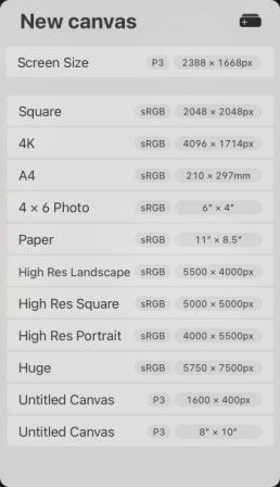
1. Colour Format
Every image is unique and has its own story to tell, but the way in which it’s told can be very different depending on what colour mode you use.
Open a new art board and set the colour space to RGB colour profile, NOT CMYK. If you were to Google this, many results will say to set your colour profile to CMYK (a traditional printing process), images will experience noticeable shifts that may result in a muted or washed out looking print, meaning less vibrant or flat. This is because CMYK (Cyan, Magenta, Yellow and Black) colour space has a subset of red, green and blue (RGB) which means it will be able to capture some shades but not all, so some RGB colours will be converted to their closest CMYK match. RGB has a wider colour gamut.
Fun fact: mixing different intensities of red, green and blue create an absolutely wide range of different colours.
2. Physical Dimensions
Knowing what physical dimensions you need for the final product is essential information when setting up your art board. If you set it to a square for example 10”x10” you will not be able to print it as a rectangle unless you crop into it. We would recommend setting the physical dimension to something quite large, such as 36”x24” as you can always print smaller. Keep your options open for future print sizes.
3. Resolution
Set your art board to a minimum 300 dpi NOT 72dpi before you create your art to avoid loss of quality and pixelation if you increase the resolution after creating your artwork. When it comes to the best print quality, 300dpi is a standard that all should adhere to. Depending on your printed size and viewing distance however, lower DPI or PPIs will still produce an acceptable looking image..
You have a lot of options when it comes to the format for your export. You can choose from good old PDF, versatile JPEG or PNG with transparency and even high-quality TIFF files that will produce an excellent print.
PPI or DPI

Don’t worry we are not going to be talking about payment protection insurance or price per index.
These are two important terms that anyone who works with images should know. Both define the resolution or clarity of an image, however each refers to a separate media – digital vs print.
PPI aka Pixel Per Inch is the density of pixels per inch, a measure used to describe screens on digital devices. Each pixel represents light coming from an individual monitor, and the PPI tells us how many such points there are in total; with exact 254mm for every square cm.
DPI aka Dots Per Inch is similar to PPI, but the pixels are replaced by points on a printout. The higher DPI means better quality because there’s more detail and sharper images – as would be needed for fine art prints or even watercolour painting. 300dpi typically equals 118ppi; when printing images at this setting it’s always best practice not to go any lower for best quality.


We have a BONUS tip for you.
File Type
When it comes to displaying images, there are a variety of options for both professionals and casual users. PNGs tend to be smaller in size than TIFF files and are better suited for great quality printing.
On the flip side however, it also has its benefits – PNG supports transparency, whereas this isn’t possible with transparent image formats such as JPEG/TIFF – so if you want your design projects processed professionally then these file types may actually give you better results.
A note worth mentioning…
Display P3 colour space was created for visual displays that are compatible with P3 such as some of the Apple devices – it is not recommended to use this colour space when printing as the colours do not translate well due to this reason as it has a different, although wider, colour gamut. It uses extra-saturated reds, greens and blue and creates very vibrant on screen art.
“Learn the rules like a pro, so you can break them like an artist.” ~ Pablo Picasso Have fun creating with Procreate!
